Details
-
Type:
Improvement
-
Status: Closed
-
Priority:
Minor
-
Resolution: Duplicate
-
Affects Version/s: 2.11.0
-
Fix Version/s: 2.11.3.0
-
Component/s: gui, gui design issue
-
Labels:
Description
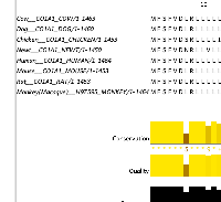
Positioning the mouse to where the height of the annotation area can be adjusted, and to a lesser extent where the width of the sequence labels column can be adjusted, can be harder than it might be as there is often a lot of white space around this small unmarked area (see screenshot).
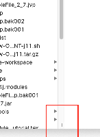
Adding a visual marker, such as a short pair of parallel lines (as used in e.g. macOS Finder, see screenshot) not only will make this easier, but will also show such a feature is present to users that don't already know.
Adding a visual marker, such as a short pair of parallel lines (as used in e.g. macOS Finder, see screenshot) not only will make this easier, but will also show such a feature is present to users that don't already know.
Attachments
Issue Links
- is duplicated by
-
JAL-4273 Visible adjuster marks to grab and adjust annotation panel height and id width
-
- Closed
-

